HOME > WORKS > Branding and Package Design
| Rustic | Branding | Food and Sweets |
Suttsu Shirasu Kaikan
すっつ しらす会館
Visual Identity Program
Suttsu Shirasu Kaikan is a small seafood restaurant located by the sea in Suttsu, Hokkaido.
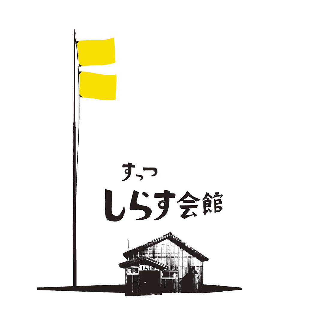
The logo symbolizes the two yellow flags that are flown on the day fresh shirasu are delivered.
すっつ しらす会館は、北海道寿都町の浜辺にある小さな海鮮食堂。
生しらすが入荷した日に掲揚される2枚の黄色い旗をシンボライズしたロゴです。

Creative Director: Hiroshi MAEDA
Designer: Hiroshi MAEDA
Calligrapher: Marutoshi Yoshino Shoten
Client: Marutoshi Yoshino Shoten
2017
JAGDA Graphic Design in Japan 2018: 'This One!' selected by Kaoru Kasai
Sapporo Art Directors Club Award 2017: Shogo Kishino Prize
Related Works|関連作品
Shirasu Products|しらす加工食品
Magazine Ad Series|雑誌広告
HOME > WORKS > Branding and Package Design
| Rustic | Branding | Food and Sweets |


